WIN
Strength, direction, competence — no decoration.
A complete brand identity for WIN — a markets and performance brand built on focus, structure, and upward intent.
- Client
- WIN
- Year
- 2024
- Discipline
- Brand System — Markets & Performance
- Status
- Shipped

Overview
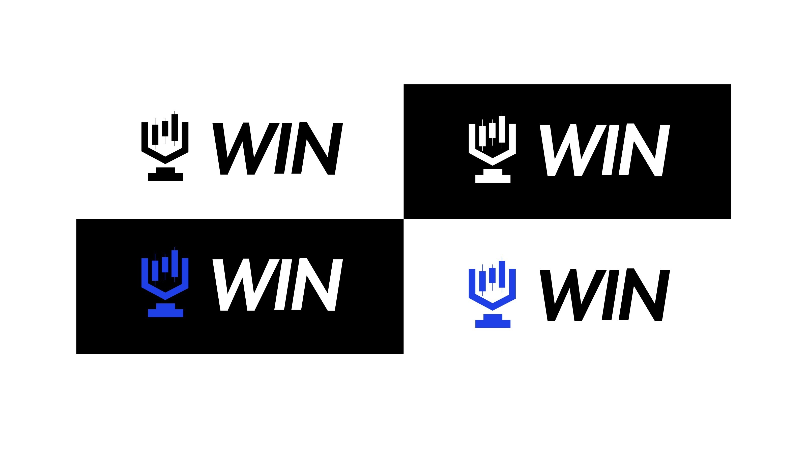
WIN needed an identity that could hold its ground in a crowded digital environment without leaning on decoration. The system pairs a candlestick-and-trophy mark with a bold, controlled blue palette and a confident type system that scales from app icons to merch.
Challenge
Communicate stability without feeling dull, and authority without feeling aggressive — across dashboards, mobile apps, and physical artifacts, on both light and dark interfaces.
Process
- 01
Defined the brand attributes: focus, structure, and upward intent.
- 02
Designed the WIN mark — a cluster of candlesticks forming a trophy, signalling markets, data, and high performance.
- 03
Built primary and secondary logo lockups with codified clearspace rules.
- 04
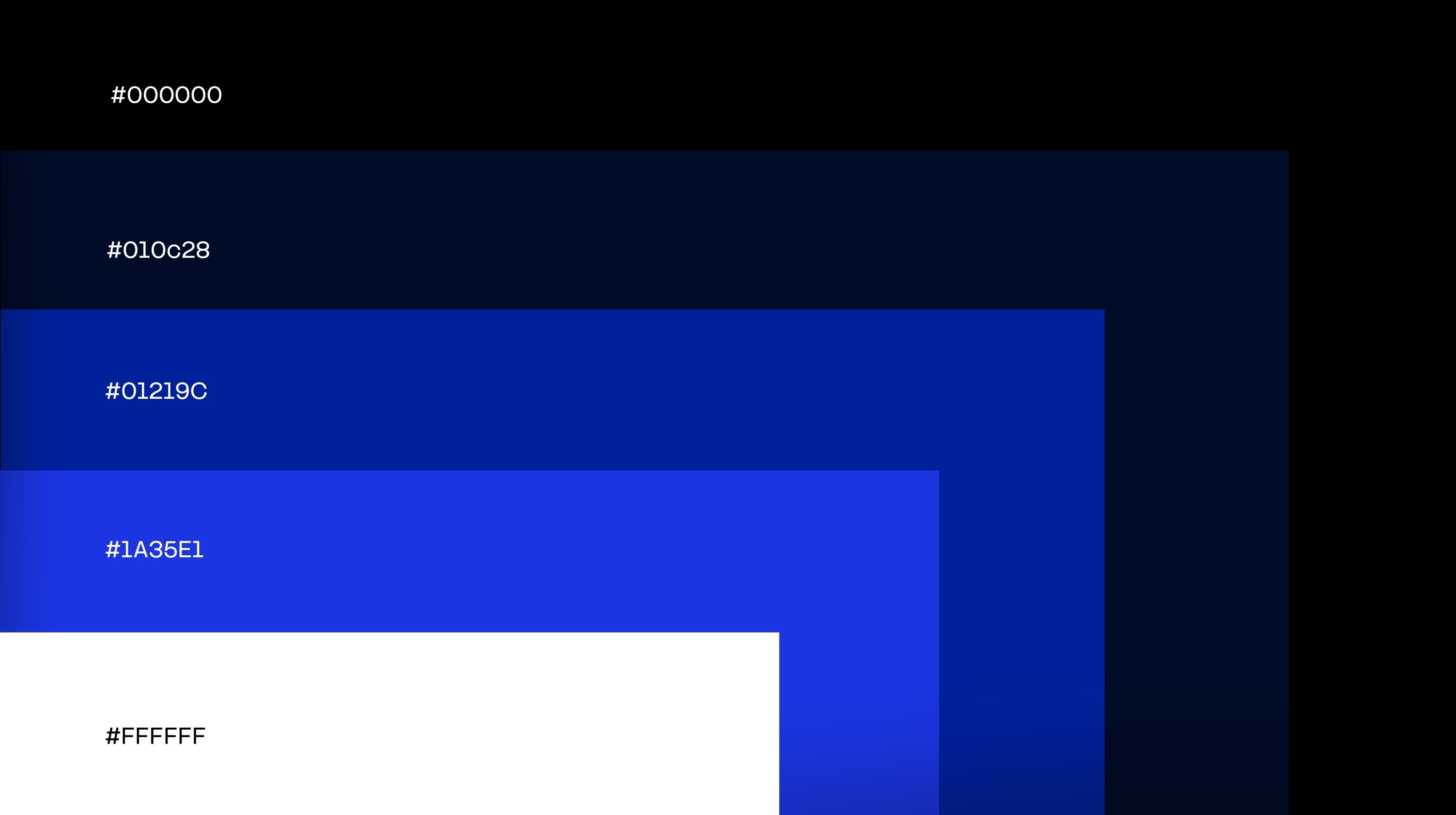
Locked the palette around a strategic blue (#01219C / #1A35E1) with #000000, #010C28 and #FFFFFF as anchors.
- 05
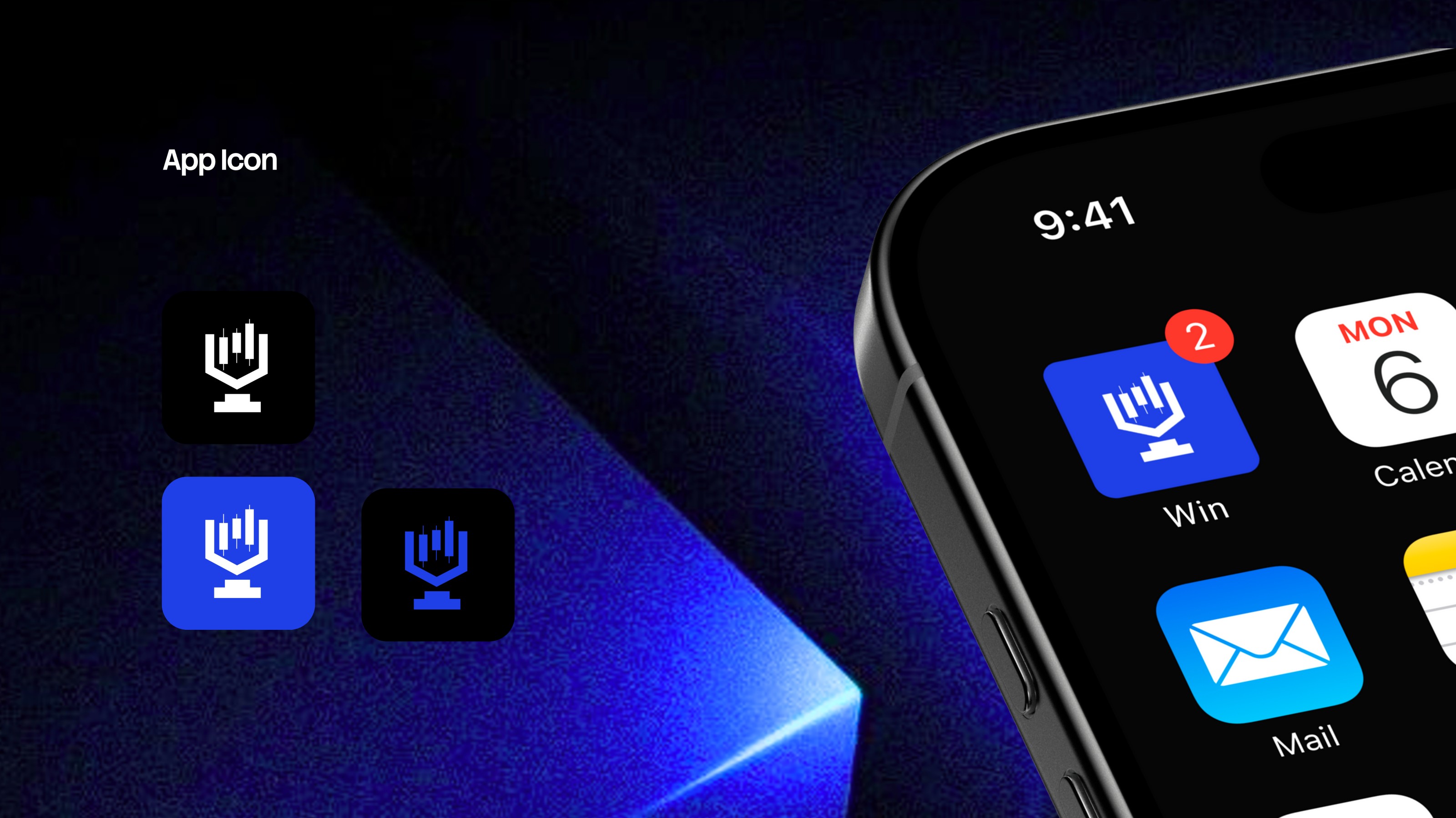
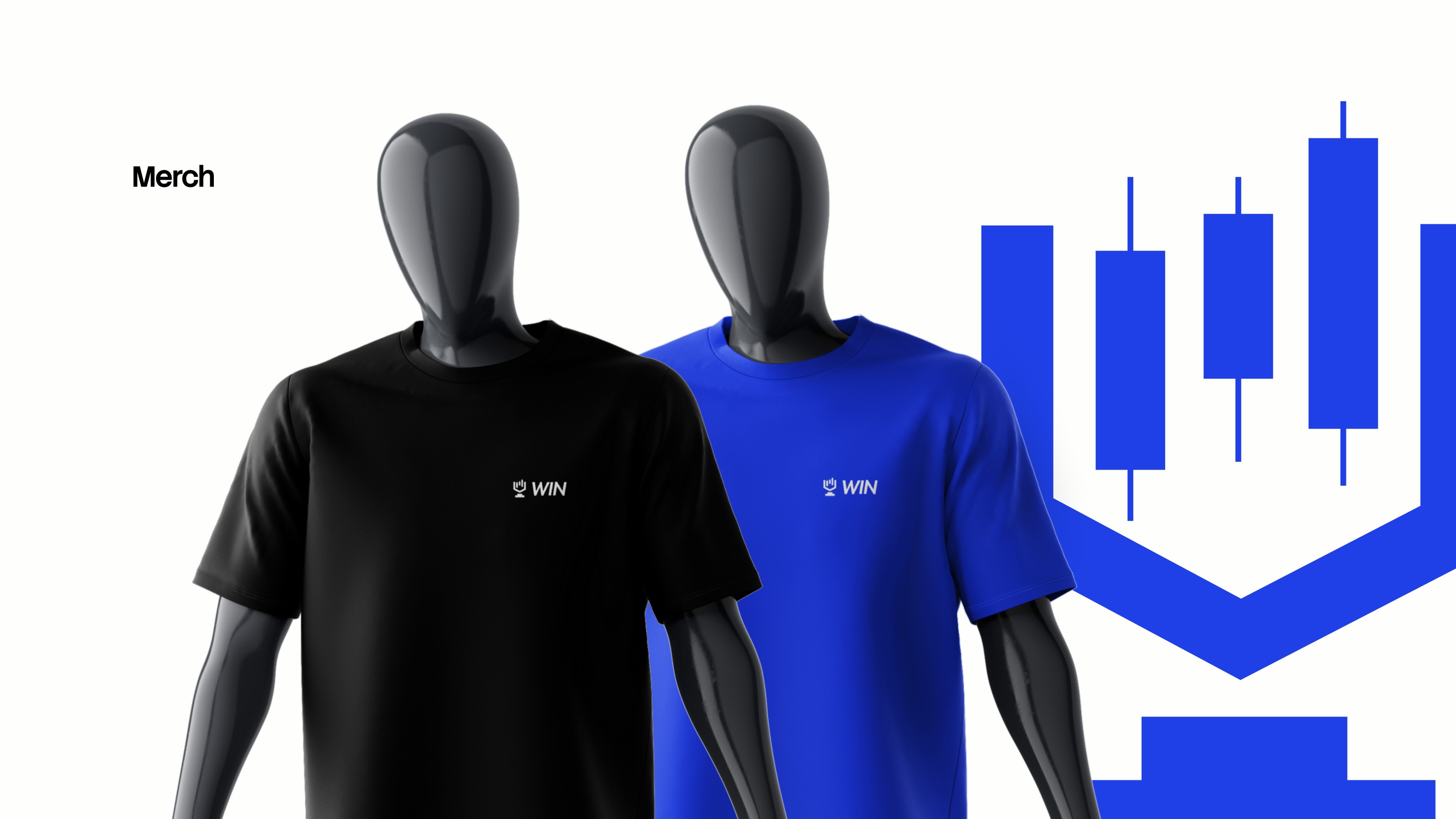
Paired Futura and Stack Sans into a flexible type system, then applied across app icon, brand collateral, and merch.
Result
A modular brand system documented in a full guideline — one source of truth that ships consistently from the App Store icon to printed tees.
Deliverables
- Logo & Mark Rationale
- Primary & Secondary Lockups
- Color System
- Typography (Futura · Stack Sans)
- App Icon
- Merch
- Brand Guidelines
Next case — 02
Flex Nightlife