Flex Nightlife
Good vibes + smooth ticketing.
A brand identity for FlexNightlife — the go-to gateway for discovering, booking, and experiencing the city after dark.
- Client
- Flex
- Year
- 2024
- Discipline
- Brand System — Nightlife & Ticketing
- Status
- Shipped
Overview
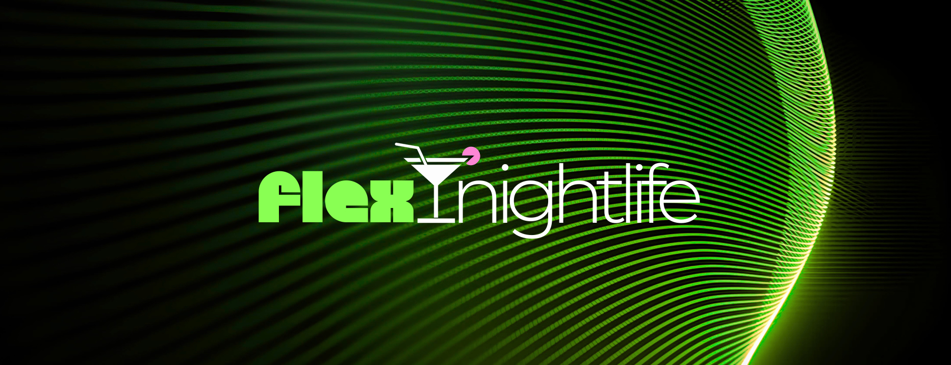
FlexNightlife lives at the intersection of nightlife culture and streamlined event access. The identity pairs a bold, rounded ‘flex’ with a sleek ‘nightlife’ wordmark, anchored by a martini-glass mark and a pink garnish — modern, social, and instantly tied to events, while still reading as a trustworthy ticketing platform (crypto + fiat).
Challenge
Hold two tones at once: the high-energy fun of going out, and the reliability of a payments-grade ticketing product — across app, web, posters, tickets, and merch.
Process
- 01
Defined positioning: the go-to platform to experience the city at full volume.
- 02
Designed the FlexNightlife wordmark, secondary ‘flex’ lockup, and martini-glass + pink garnish mark.
- 03
Codified clearspace and pairing rules for primary and secondary logos.
- 04
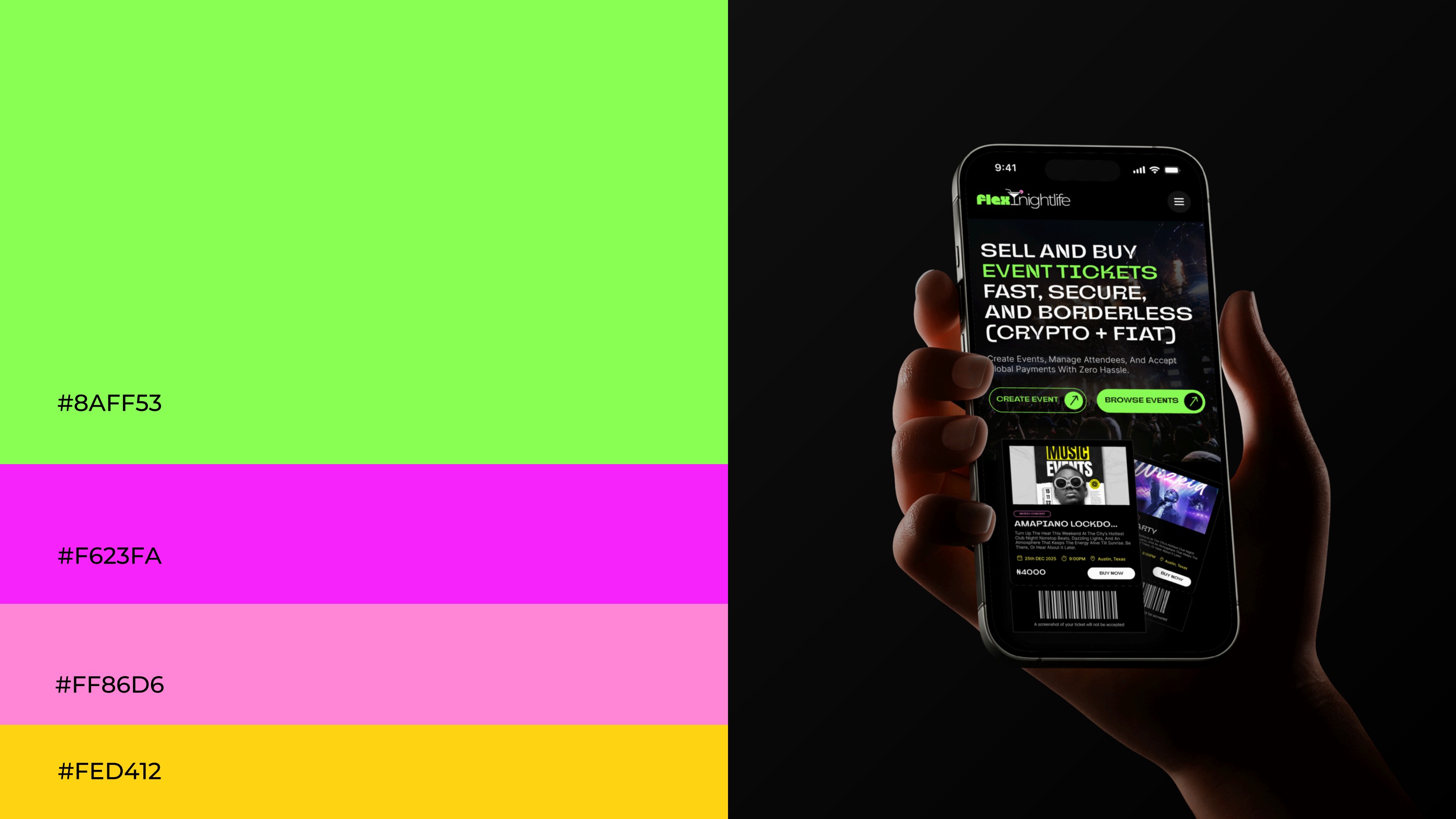
Locked the palette around #8AFF53, #F623FA, #FF86D6, and #FED412 against black and white.
- 05
Paired Geodezyx (display) with Montserrat (body) into a flexible type system.
- 06
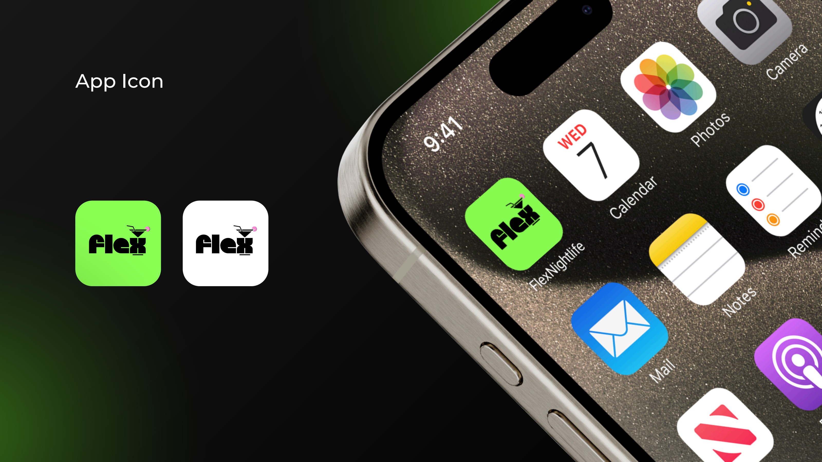
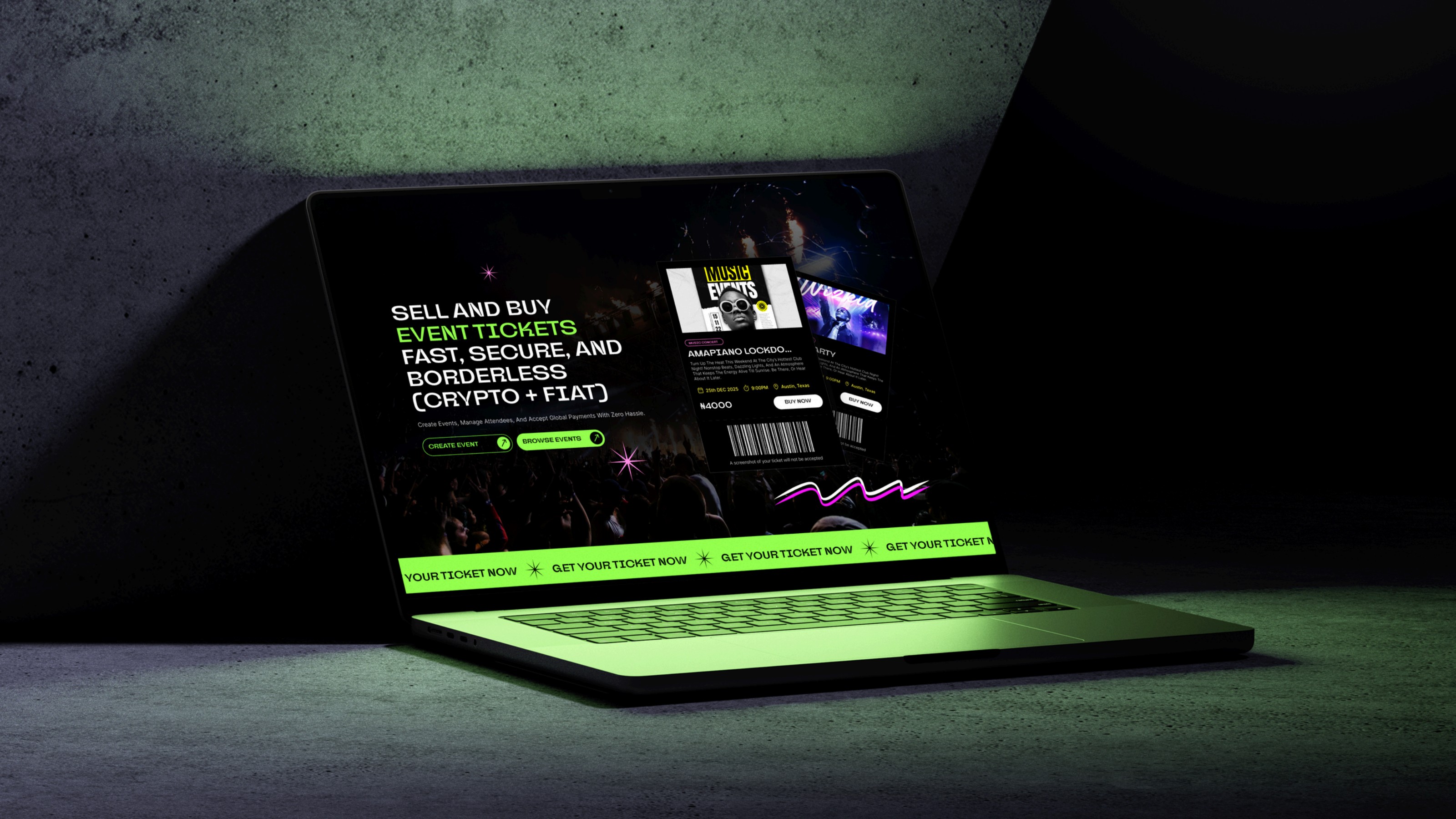
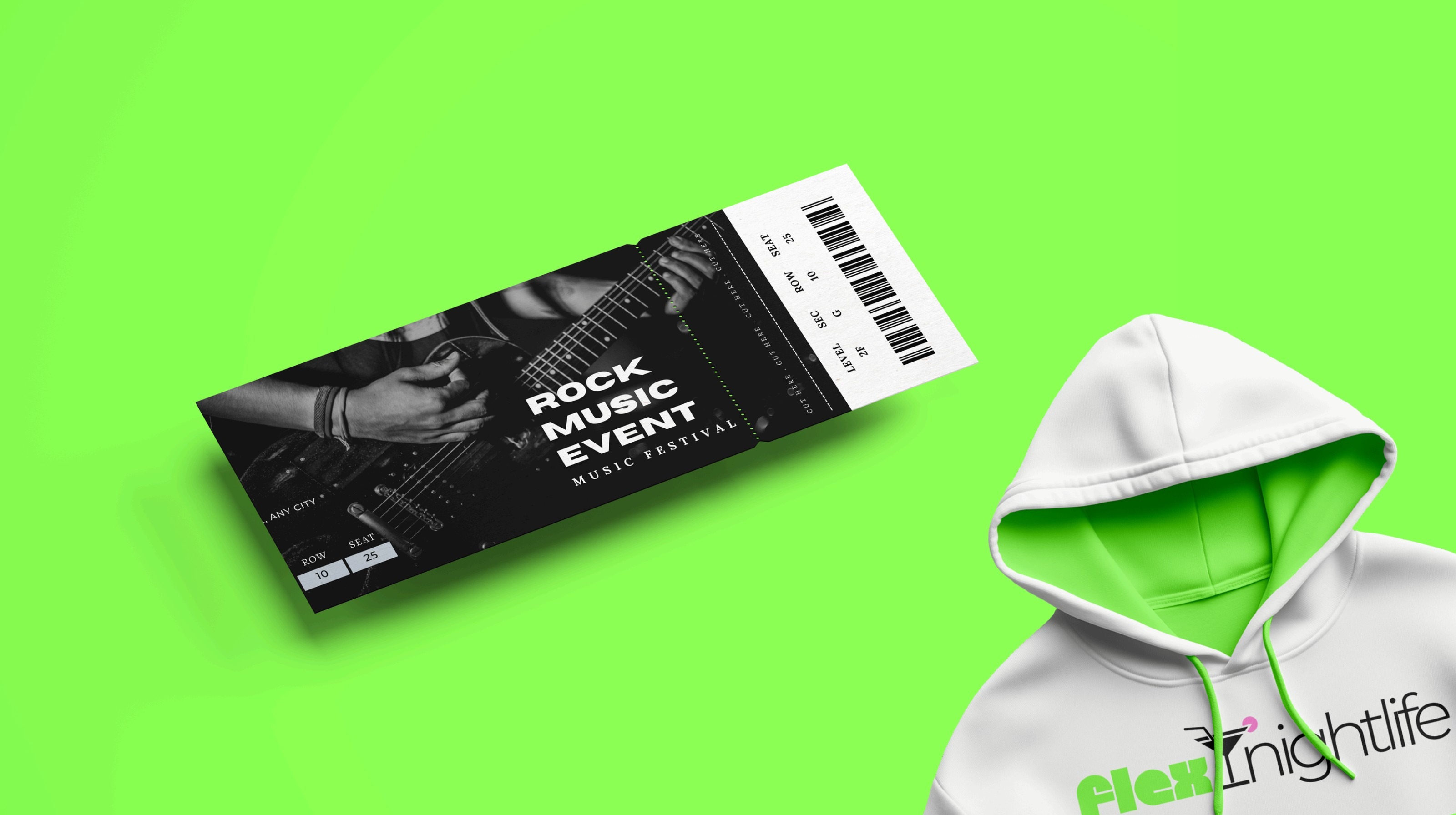
Applied across app icon, product UI, event ticket templates, and merch.
Result
A documented brand system — logo rationale, color, type, and usage — that ships consistently from the app icon and ticket screens to printed merch.
Deliverables
- Logo & Rationale
- Primary & Secondary Lockups
- Color System
- Typography (Geodezyx · Montserrat)
- App Icon
- Ticket & Event Templates
- Merch
- Brand Guidelines
Next case — 03
MoyoPay